Welcome to Design track mind by Melissa Gulley

I am an interior designer from Newton, MA having a lot of fun writing this blog between client appointments, kid stuff, kid school stuff, dog stuff, husband stuff, husband's company stuff (http://www.fueldog.com/), life stuff, old house stuff, family stuff, extended family stuff and the rest of the detail stuff. I am not a writer (clearly) so please ignore the typo's, spelling mistakes and desperate need for proofreading.

The Greatest Product in the History of Mankind!!!

Last winter in Newton Massachusetts, our bedroom was so cold at night that the simple act of getting into bed was absolute torture.  Allowing your skin to touch the freezing sheets felt close to bracing yourself for a firing squad.  I love our bed and after 10 minutes of swearing and an hour of warming up we sleept soundly.  But seriously an hour of warming up - NO just NO, I could not take it one more night- my feet were turning into permenant flesh popsicles.  I had dreamed of a better solution, maybe we could put an old fashion bed warmer under the covers or a hot water bottle- but that just takes care of your feet, what about the rest of your goosebump-laden body? 

Then I found this (see amazon link to left)  The Sunbeam Electric Heated Mattress Pad.  This is the best invention I could ever imagine- it's absolutly perfect in every way.  It has dual controls- yup thats right we can each control our own sides of the bed seperately.  It also has three areas on each side that are controled individually- if your feet need a level 5 warm but the rest of you needs only a level 2- you got it!  And Just when you thought it couldn't get better- there is a pre-heat setting!  Push one button 30 minutes before bed and the bed warms up then automatically shuts off 1/2 hour later when you're ready to hit the hay.  Now we look forward to getting into bed, we slip under the covers and lay there litterally saying the same words every night "Oh My god this is SO AWESOME, who knew life got this good"  We literally giggle like little kids who just got away with stealing a pound of candy. 

Now I want you to notice that the cost is under $100- seriously this is the best money I have ever spent.  Had to tell you about this!  I owe it to the interior design obsessed world to announce that the best money spent was not on designer fabrics or wall paper but this humble, inexpensive, never to be visually noticed product.  Happy warm feet to all- Cheers!

Anything But Boring. Great Bathroom Designs

I am sick of boring bathrooms- actually I am sick of boring everything.  You all know I encourage the personalized, original, inspired, unique.  This has nothing to do with style- I just want individualized anything.  The bathroom is a particularly fun place to design, you can do a lot without getting sick of it- you're only in there for a minute or two.  Think of it as a little jewel box.
Check out these interesting spaces:


bed bath
Apartment therapy
Notice that many of the bathrooms (not all) used simple classic plumbing fixtures and then added character that could be changed without calling the plumber or costly construction.

Enslaved by Possessions

So who wants to be held hostage by your possessions?  I think no one!  No one enjoys worrying 24/7, whether the silk covered sofa will survive another day. 
What about the white carpeting? (I’m enough of a stress case, that would put me way over the edge!) 
The kids, the dog, the sun- oh my!
dog-or-children-dog-destroyed-couch


If you’re like me (I need to think someone is), you yell at your kids enough.  Some days more than enough.  Why add unnecessary things to yell about (silk sofa, for example).  We do have rules in our house, all food stays in the kitchen or dining room, no arts and crafts in the living room and NO SPORTS in the house. have-children-or-get-a-dog-kids-and-tv-covered-in- Other than that we are pretty lax (the house is drip dry)- my kids have lived with beautiful things all their lives and have a healthy respect for them (read: fear of me) as long as most of the stuff in our house is more carefree.
The things kids, dogs, and in my case messy husband, tend to stay clear of are: Window treatments, light fixtures, art, mirrors, accessories on mantles (occasionally on tables) and case goods (side tables,bookcases,secretary's,sideboards etc.).  These are areas where I can have my Interior Design fun and splurge.
With all this said, to keep stress to a minimum and not sacrifice style, here are some areas where you should consider going almost industrial: Coffee tables, carpets and upholstered furniture.

Coffee tables

These vital pieces should not be so precious that you can’t put your feet on them, my advise is to look for something upholstered (ottoman with tray), weathered, painted (you can always repaint), metal and defiantly distressed.  Wear and tear on distressed furniture only adds character but a scratch on a slick piano finish table – it’s ruined!  Don’t set yourself up for constant care and militant discipline of your family if you’re not that type of person. This is also a piece that does not need to “match” the other tables- it should be interesting- have fun with it.  Even if you already have polished wood just accept that you will have to refinish and let it go- Live!
elle decor leather sofa

Carpets

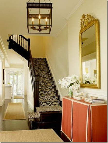
1. Sea grass- durable, chic, affordable and can be layered upon with other area rugs like zebra hides or orientals (certainly to hide stains if they occur, but no need admit to that motivation).  It also looks great and takes on character when worn. 
2.  Another work horse is hand-knotted, 100% wool carpets.  The more pattern the better, but stay away from adding silk to the pattern (cleaning nightmare).  These carpets have been getting the job done for hundreds, if not thousands of years.  Literally, you can’t kill-em. 
3.  My last suggestion is something for traditionally more casual spaces –  (However I used really fun ones in my formal foyer- LOVE THEM) they are Flor carpet tiles.  We live in New England so there’s always mud, snow, rain, etc. (plus I have two dogs in addition to my kids) and these carpet tiles kick serous New England Butt!  You can even pull one up and wash it in the sink- really!  I chose a great texture and colors and threw them under formal antiques and love the playfulness.
zebra stairs

Upholstered furniture

The big one - sofas , chairs, ottomans etc.… these get major abuse!  Some hints to help are:
1) SLIPCOVERS that can be washed- ok really this one is huge and has saved my house.  Slipcovers are no longer big sloppy loose, baggy sacks over furniture, but tight beautifully made covers that fit like gloves.  You may not even be able to tell that something is slip covered anymore.  This may seem crazy but the real work-horse of slip cover fabric is pure white denim or linen.  It can not only be washed but bleached as well (think of the possibilities).  If you used yellow or green or blue you can wash but we all know some stains just don’t come out- UNLESS you can bleach it.  If you plan to wash your slipcovers please be sure to wash and dry the fabric prior to having them made in order to pre- shrink it.  There is nothing worse than slip covers not fitting after washing.
country_living yellow LR
(country living)
2) Leather!  Leather is so great and if already slightly distressed it will only take on more character when used.  You can wipe offending spills and dirt right off and dog hair doesn't stick- hooray!
dog on leather tufted sofa
3)Other fabric options some more and/or less expensive and fab than others: wool mohair (you can find antique chairs with the original wool mohair still intact- seriously tough and deliciously fabulous stuff), Toray Ultra suede (the real ultra suede- not the cheap micro suede version) and finally some manufacturers are introducing indoor outdoor fabrics that are finally not like sand paper- these do the job incredibly well.
Ryan Korban leather sofa
(Ryan Korban)
When I grew up my parents didn't decorate the way people do today and I dreamt of the beautiful house in which I would someday live.  I love beautiful things and need spaces that are visually appealing to mostly adults but not at the cost of my kids and dogs not sharing them with me.  Keep some things easy care and go fabulously nuts with the rest without the stress of being held hostage by your things.

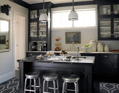
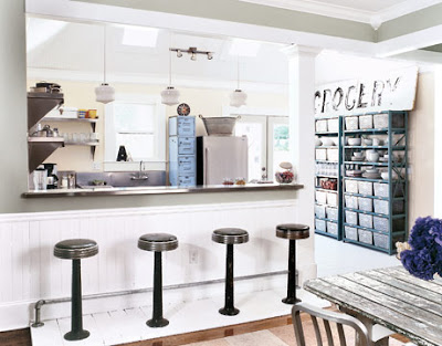
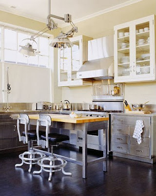
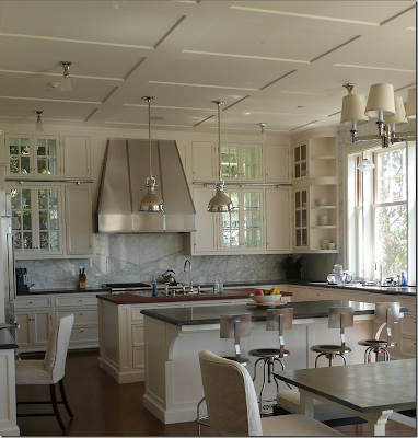
Kitchen Obsession: Great Out-Of-The-Box Kitchen Inspirations


I would LOVE to renovate my kitchen- both my husband and I love to cook –(actually Kevin is the cook and I play cook on his off days)  In our house we have a formal living room, formal dining room, formal foyer and kitchen - that makes up the first floor.  We are really BIG on family dinners and try to have a sit down dinner with our kids every night.  We eat in our formal dining room and we play games like: high/low, what's the best “high” part of your day and the “low” the worst part of your day.  This is the only way we get more than a grunt from our kids about their day.  This also involves them in our day and shows them that grown ups have great parts and not so great parts of their life too.  I feel we are really missing the casual eat in and family room part of the kitchen of my dreams.  I do love the look of my eclectic, totally out of the box kitchen but we need to take it up a notch in functionality.

I am constantly scouring images in magazines and on the web for interesting kitchens.  Spaces that are done differently, kitchens that wouldn't date as quickly, kitchens that maximize drama and functionality.  I want a space with a ton of personality (our house has a ton of character- that's code for old piece of crap!)

I want warm, friendly, personalized, sunny, happy and carefree.
Chalkboard paint + red + white kitchen: Farrow & Ball 'Blazer,' from Met Home
Metropolitan home
Like most kitchens ours is the heart of our home and needs to help keep our super busy lives organized and clutter free - everything needs a place.

Sun is so important to me- i want to open the back of the house up to our Awesome backyard that no one uses and that visitors don’t even realize is there.  I want a wall of windows in the kitchen - the morning sun!


MS Living

Apartment therapy

House Beautiful

Coastal living


Nature Inspired Kitchen Wall
An earth friendly kitchen in stone, wood and tile.
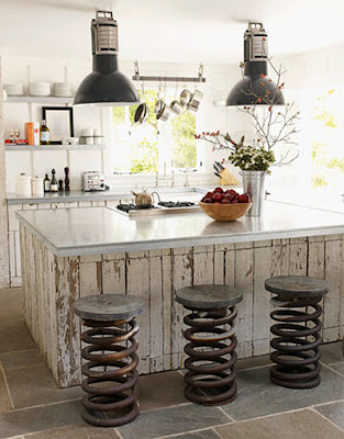
The stone wall in this rustic kitchen is highlighted by salvaged wood beams and white tile. Floor made from flagstone and reclaimed hemlock wood mirrors the stone wall panel and timber ceiling. A painted white island with a stone top is used for food prep, add teak stools so it can double as a seating area. Pendant lighting that is simple makes it modern.
Photography: Angus FergussonRoom design: Jill Kantelberg
Jill Kantelberg/ Angus Fergusson


tuckey-kitchen-james-brittain-photo[1]
Jonathan tuckey
australiankitchenrichardpowers[1]
Richard powers

www.decoriz.com

Desire to inspire

Gianetti designs


www.junkinescapeds.com

Some of these kitchens are quirkier than others, but all challenge the way to think about kitchens.  The hardest thing to juggle when your wanting out of the box is resale value.  Do you do it for yourself and hope in 10 years someone else will appreciate your vision?  In 10 years will that new person rip out any kitchen you put in place anyway.  Hummmmm, what to do?  Everytime I think I’ve found the perfect idea, I find a new picture of something more interesting.  in the end I’m so fickle I might just have my current kitchen forever.  If I were my client, I would have to fire myself.

Media- the perfect storm

Ok, so I want you to know I am not trying to make you vomit by patting myself on the back (you say: yada yada yada here it comes- eyes rolling).  My life is usually fairly (correction: completely) boring and I am just so shocked at whatever this freak Twilight-like stuff that's happening in my life- I wanted to share my thoughts and thanks.
The past year and a half has been nothing short of amazing (no really- freakishly amazing)!  I put up my website, I started writing my blog (something I never thought I could do or had the time for), I started tweeting (ditto, and I suck at it), I got photographed for Country Home magazine, I (my house) appeared in Kitchen and Bath Makeover magazine, I was hired to be the Interior designer for This Old House TV show, My work was in This Old House Magazine a couple times, An article about me was published on the front page of the Newton Tab newspaper (Thanksgiving week no less), I have been quoted in Better Home and Gardens magazine, I was in New England Home Magazine, I did a piece for HGTV Blog and website, This month my house is in a four page spread in Better Homes and Gardens Magazine and I am guest Blogging for New England Home Magazine.  All of this after 12 years of obscurity, keeping my head down, working hard for clients and living on word-of-mouth referrals.
Holy shmoly!!!!!!

Last night at my book group someone asked me why all this is happening now?  Was it the TV show, was it the blog?  What was it and how did it start?  My answer???? I have no flipping idea! (I am surprisingly eloquent at times).  My grandfather used to say “luck is when hard work meets opportunity”.  Is that it?  is this just good luck or hard work meeting opportunity (notice I put luck first)???  Over the last 12 years of working in this industry I must say I always try to do my absolute best.  I am honest to a fault, straight forward, happy and friendly.  I believe in making my client’s feel good about their taste and choices and hopefully they love the design process.  I am by no means perfect, I am a small company and if one of my kids, husband or I get sick, the world stops.  I try to return phone calls and emails within 48 hours (I get hundreds of emails everyday)  Could I be speedier- yep, absolutely, but there is only one me and I do my best.  I am 15 min late for everything and the hip outfits for the first few appointments degrade into just shy of my gym clothes as time goes on (you think I’m kidding- you’re lucky I shower most of the time). Of all the amazing designers out there, I am as good as others at some stuff, and I am far worse at some stuff than many, but I do try hard and I really care.  I just can’t believe that after 12 years of designing people’s homes- I am finally getting noticed.  Ya freaking hoooooo!!!!!!!

For all this I want to thank all of my wonderful, incredible clients who have made my job so amazing- I adore every one of you!  I also want to thank all of my vendors, you are the backbone of my success.  In an industry that Designers work alone or with a very small staff, it is the wonderful relationships with my vendors and clients that make my job so amazing and supremely satisfying.  I love that my kids see that mommy loves what she does for a living- I wake up and can’t wait to start working.  I hope they find the same passion for their careers in life. 

High Points of High Point

Last week I spent 4 days in High Point North Carolina at Furniture Market (that’s right ladies although it was work- I didn’t have to put anyone to bed or yell at anyone to get to school on time- HEAVEN!).  I went with two great friends, we toured 6 huge showrooms in-depth (Hours and Hours) and did drive-by’s on dozens more (maybe hundreds- my aching feet would have guessed thousands)- really fun! (Design Porn as my husband calls it)  High Point is a town in NC that comes to life for two weeks of the year with huge showrooms in fantastically enormous buildings to show each companies latest and greatest furniture, lighting, carpets, accessories and fabric.  It is most frequented by furniture showroom and furniture store owners, buyers and employees.  Increasingly Interior Designers have been going, this gives you a much more in-depth understanding of various lines you can offer to clients and a greater more macro understanding of the industry at large.  Plus, it keeps you on the pulse of what trends and directions the industry is going in and how to creatively use various looks in clients homes.  Going with friends (other interior designers) gives you additional eyeballs to see the bevy of ideas.  The two friends I went with - Fabulous Designers Heather Vaughan and Betsy Bassett - were so much fun.  Both have a different way of looking at and applying each thing we saw, thus heightening all of our takeaways from the experience.
If I had to boil it all down to common threads I would say- the Restoration Hardware “greige, distressed, vintage, flea market” look was in full force (weren't we done with that by the second or third Restoration Catalog?  Apparently not, they saturated us to death with the look).  There was a ton of deconstructionist looks from lighting to furniture to rugs and accessories in all aspects of urban-industrial and somewhat organic (which was refreshing).
image
Aiden Grey
image image
Aiden Grey
image
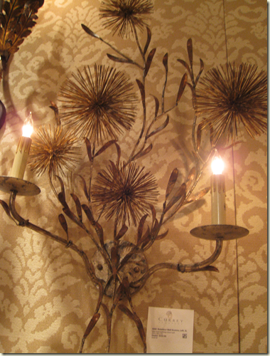
Great organic rusted metal sconce from Currey and Company
image
Currey and Company- comes in many sizes and shapes
On the flip side, there was also more of the clean “Modern” look of paired-down case goods with no molding, clean lines and contemporary hardware only this time in colors. Color, color everywhere. 
image image
Global Views
image
Hard to tell this is an amazing “stop you in your tracks” Aqua glass covered night stand at Worlds Away.
image
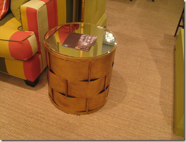
Great fun side table from Worlds Away
image
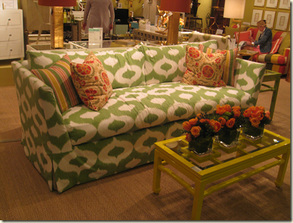
Color Color everywhere at Worlds Away- notice the great Yellow lacquer coffee table- they came in every color.
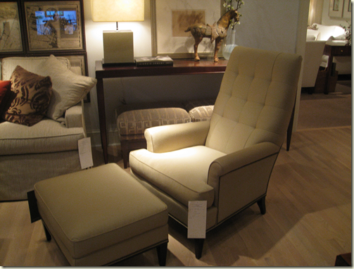
In the middle of the two deconstructed/distressed and the clean lined contemporary colorful there was something else……. Mid-Century and Art Deco styling in lighting, upholstery, case goods and accessories (this seemed new and interesting to me). 
image
Mid-Century styled chair (uber comfy) at Hickory Chair- the great thing this photo illustrates is the mixing of styles in the showroom scene, everything goes with everything- well done HCC!
image
Channeling Dorothy Draper at Hickory Chair
image
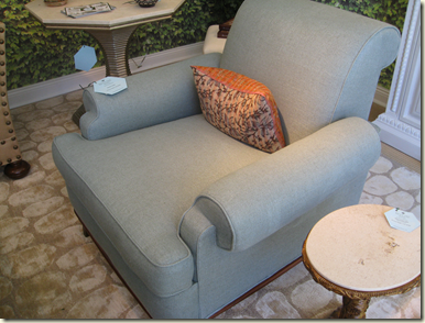
Retro styled chair at Bee Line by Bunny Williams
image
Very Deco club chair at Century- it’s huge, comfy and it swivels!
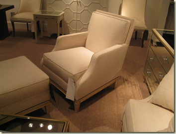
The thing I really liked in the larger showrooms we toured was an emphasis on comfort (finally), cleaner silhouettes (not so much contemporary but I would say clean traditional to transitional) and comfortable (worth repeating)!
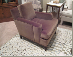
image image
image
image
image
Chairs at Hickory Chair – clean, classic and beautiful (comfy as can be)
There was also a dotting (as well as the literal plopping) of ethnic in the styling of traditional,transitional and contemporary- Asian, Moroccan, African, and European (English-although for me this does not necessarily suit the ethnic category as much as the “I'm well traveled look that abounds)
image
Union Jack perch at Pearson Company- Absurdly comfortable!!! (Union Jack was absolutely everywhere)
image
More from Pearson- the scale of these chairs was so cool!
image
Hickory Chair stools (Mayan inspired)
image
Asian inspired side table by Hickory Chair
image
Chinoisere meets out of Africa at Hickory Chair
image
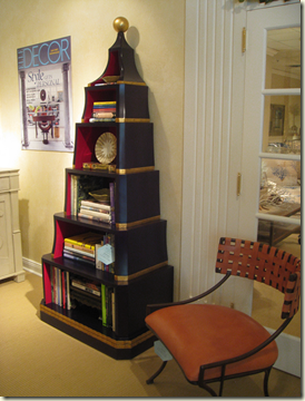
Asian Eterge at Bee Line
image
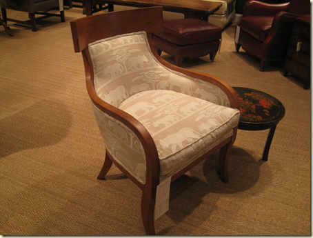
Great Safari fabric at Pearson- also terrific chair!
image
Absolutely Fab tortoise chair at Century
image
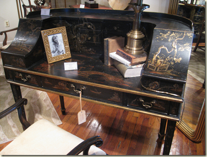
Century does it again- unbelievable table, can’t wait to order this!
image
Century
About 8-12 years ago some of my clients wanted me to basically make there houses look as though they were very wealthy (fancy, over-designed stuff-yuck!).  I thought this so strange and often misguided, in New England the real way for your friends and coworkers to see you as “loaded” is to use thread bare antiques, oriental carpets that your golden retriever chewed and books “Old Yankee”.  Never talk about or mention money and keep ‘em wondering.  Now the world has changed (thank god) and the new posh is not about having fancy and expensive, it’s about looking relaxed, well traveled, worldly and well read.  Anything that looks as though you tried too hard is OUT! but unlike the “Old Yankee” look- comfort is most important.
image
Hickory Chair (English trekking chair)
Basically- “CASUAL and COMFORTABLE” in any form or style that represents who you are.